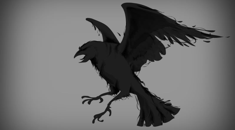
Tirian wrote:You know, a slightly steampunk theme could be cool as it would time-neutral (or maybe I should say time-ambiguous). I'd love to see a raven etched into a beaten piece of chest armor or shield, but that's just a thought since I'm not equipped to make a mock-up
That's true. It does need to have some transparent elements since it will be worked into this site (the forums) and the main site whenever we get around to replacing it with something more appropriate.
When the idea of a new logo was first presented, I actually had in mind something more along the lines of a full body mockup of a raven, but I haven't the time or inclination to really take it in the direction I wanted. I also lack the artistic talent to really do what I have in mind. (Something akin to the local cultural drawings of roadrunners in particular--i.e. a bird-like visage with pointed edges but more raven-like proportions, obviously.) The first attempt after about 10 minutes' time before lack of patience struck came up with this:

- raven-test.png (2.17 KiB) Viewed 7781 times
Obviously, it has to be less Batman-esque than this example, would ideally have some indication of feathers trailing off the wing(s) while still retaining the characteristically enlarged beak of a raven, and somewhat more detail added to the logo might be a plus. Even something with multiple objects would be fine, like this:

- raven-test-2.png (3.78 KiB) Viewed 7781 times
Hell, even maybe a simple line drawing outline like this would work, too:

- raven-test-3.png (3.59 KiB) Viewed 7781 times
Of course, the problem with full silhouettes like the one I did above, particularly for various species of birds, is that they're easily confused. Is it a raven or a hawk with congenital deformities? Caricatures of birds displaying talons are invariably mistaken for various birds of prey (ravens are typically opportunistic scavengers, albeit very intelligent ones) and are often portrayed on coats of arms. I don't really want to get into debating what any of this may or may not mean in context, because Tirian provided a very insightful link
in this discussion of a similar topic and why we may best avoid things like the double-headed eagle as currently graces the front of our guild tabard.
I know my responses are probably coming off as anal retentive. If so, I apologize. I have my reasons, and specifically I would suggest that anything we do for the site should be done with the possibility in mind that it'd make for a recognizable logotype on a t-shirt or similar. It also needs to be distinctly "ours;" something that could be recognized across the room as uniquely us in a crowd and would work equally well for conventions related to World of Warcraft--or something vastly differently like Modern Warfare. I'm not an artist. I have, however, done enough graphic-related work (mostly related to logotype) for purposes of high-quality printing for a couple of local companies, and I know a little bit more than the average Internet-goer about various things in the field. This is also why I would like something that serves multiple purposes so that we can show that we're most awesome guild ever. Or at least within reason (I admit the design I slapped together for the forums really does suck--I promise I'll get around to fixing that eventually).
Also, this probably goes without saying, but the licensing rights of the logo should fall probably fall under some Creative Commons license such as the Attribution-Noncommercial license or something similar. i.e. the artist needs to absolve all claims to the work to the guild so that everyone who is a member can use it as they see fit (with the exception of commercial/financial gain, of course). The intention being that the logo design would stay with the guild regardless of the artist's/designer's status.


